
Andrew delivers top-notch work and is a pleasure to work with.

Rob Imrie
Founder and CEO of AccessFuel
Andrew delivers top-notch work and is a pleasure to work with.
Rob Imrie
Founder and CEO of AccessFuel
We aimed to turn messy marketing numbers into a story you can actually act on — not just dashboards.
We aimed to turn messy marketing numbers into a story you can actually act on — not just dashboards.
Creative сhallenges
Building a brand and site for a technical marketing platform required striking the right balance
We needed to feel deeply data‑driven and precise, yet remain approachable and human. The goal was to communicate sophistication without alienation — clarity over complexity.
Creative сhallenges
Building a brand and site for a technical marketing platform required striking the right balance
We needed to feel deeply data‑driven and precise, yet remain approachable and human. The goal was to communicate sophistication without alienation — clarity over complexity.


Design Decisions
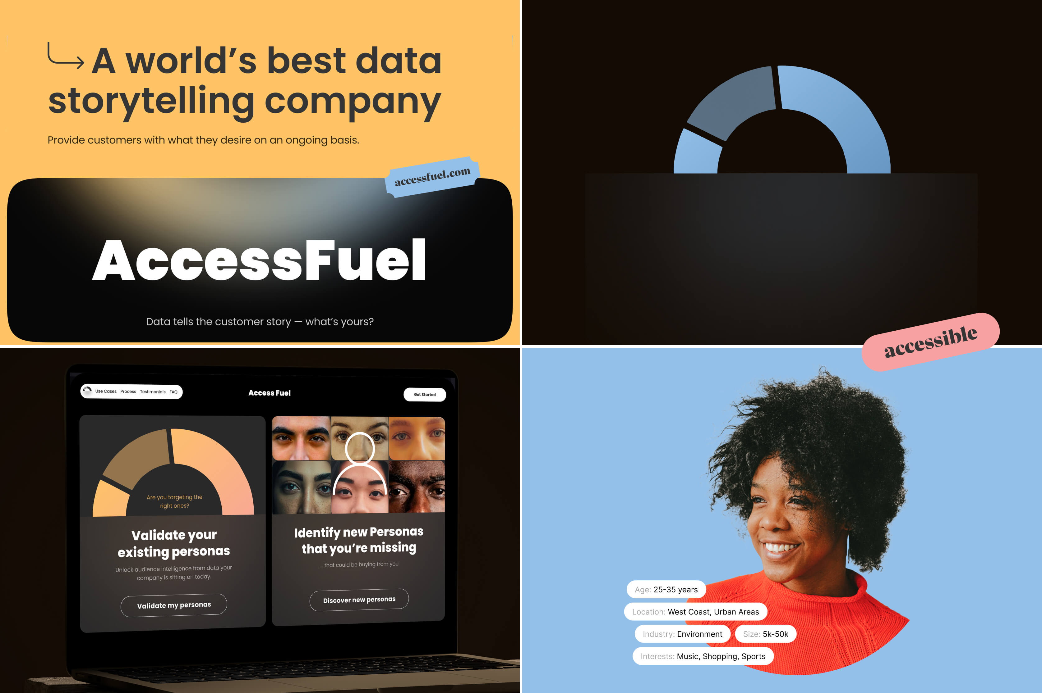
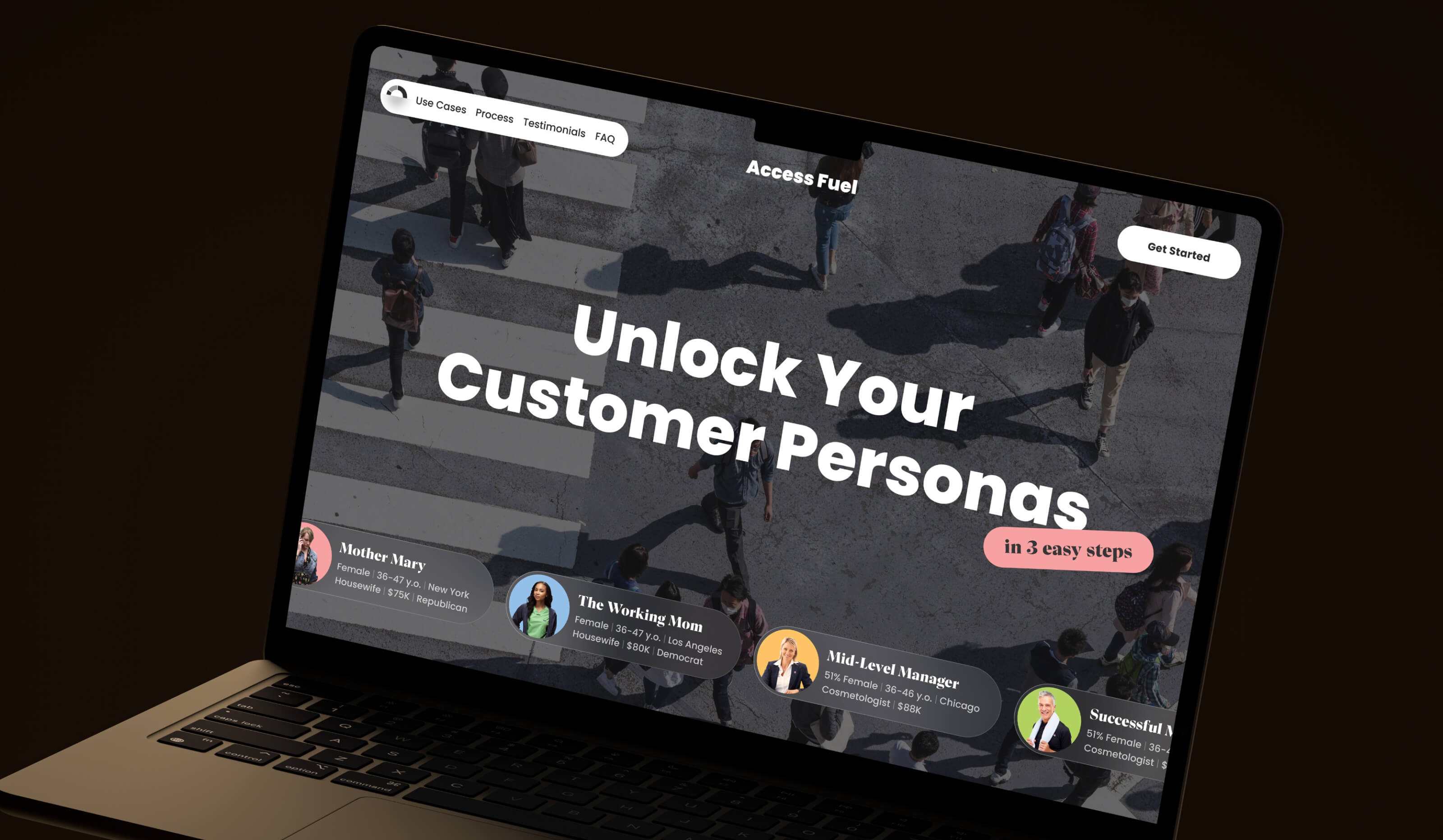
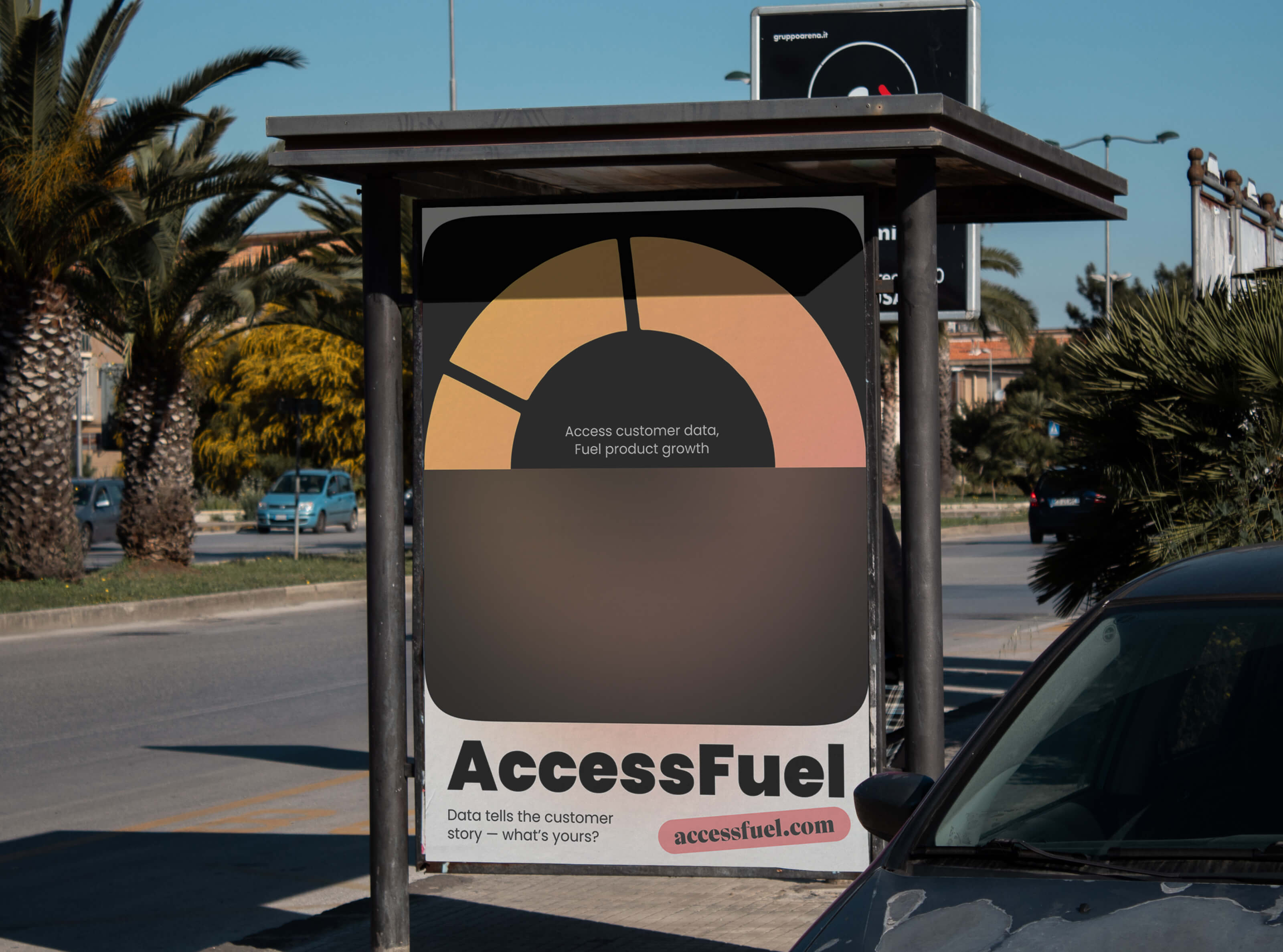
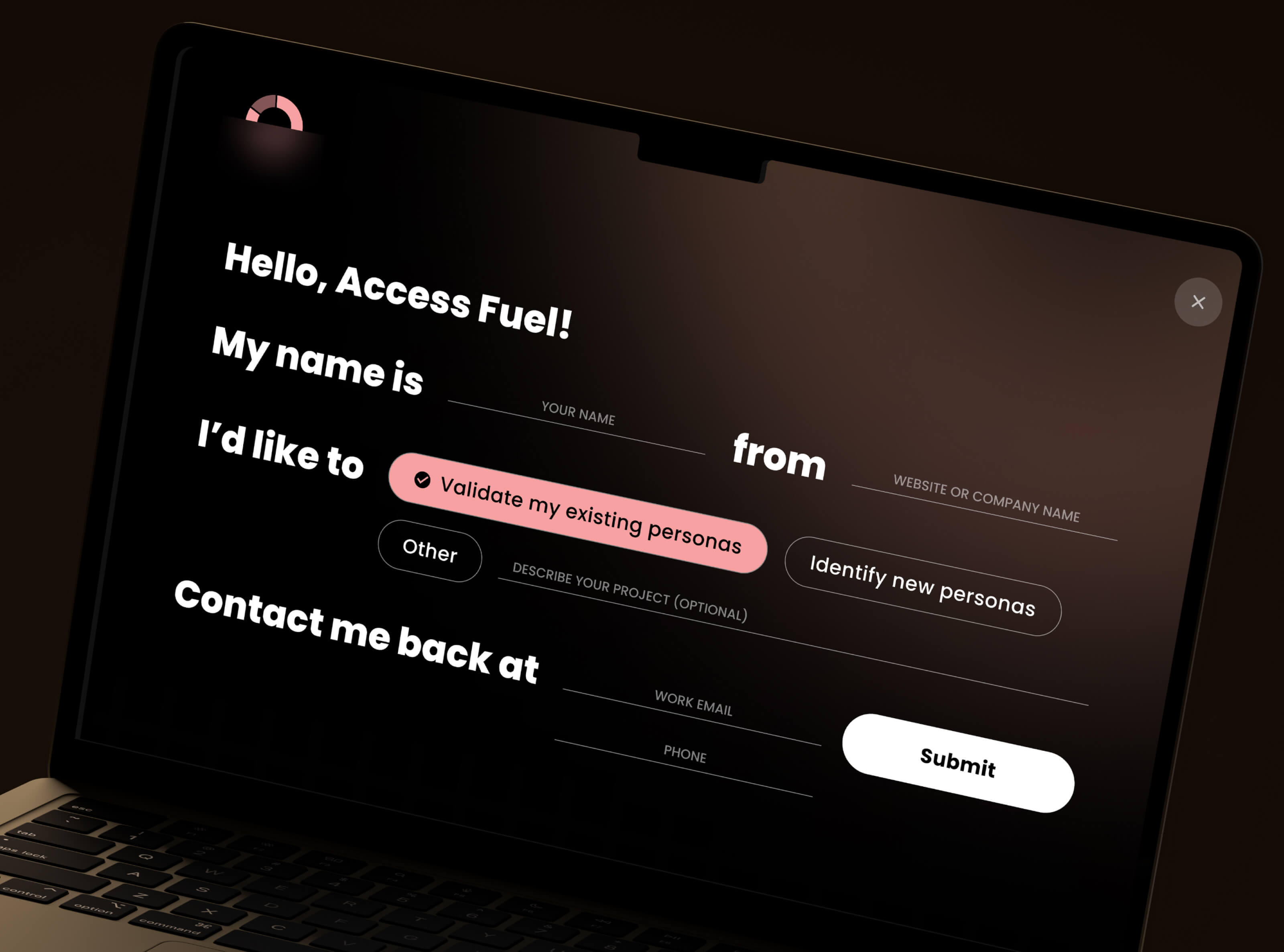
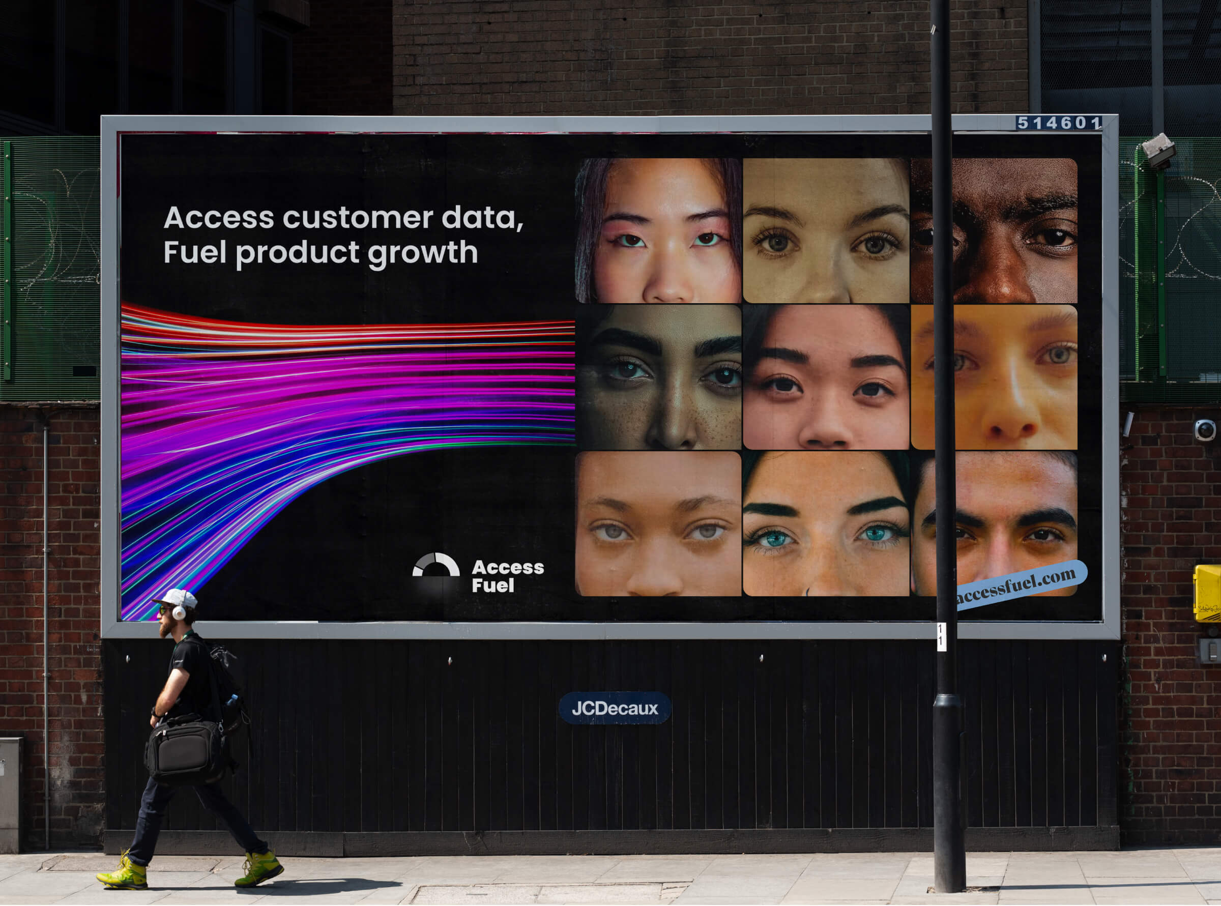
The visual identity for AccessFuel is built around clarity and energy. The logo combines sharp edges with a sense of forward motion — a nod to how AccessFuel transforms scattered data into forward momentum for marketing teams. The icon suggests structure and flow, echoing the platform’s data intelligence roots.
We chose an intense orange-red as the primary color to cut through the noise typical in SaaS spaces — bold, urgent, and hard to ignore. Paired with a clean white canvas and minimal typography, it gave the interface both focus and warmth. The website layout mirrors the product’s modular nature: structured blocks that allow for flexibility while maintaining hierarchy. Every page element — from the dynamic curves in backgrounds to the animated lines in illustrations — reinforces AccessFuel’s promise of clarity through structure.
Design Decisions
The visual identity for AccessFuel is built around clarity and energy. The logo combines sharp edges with a sense of forward motion — a nod to how AccessFuel transforms scattered data into forward momentum for marketing teams. The icon suggests structure and flow, echoing the platform’s data intelligence roots.
We chose an intense orange-red as the primary color to cut through the noise typical in SaaS spaces — bold, urgent, and hard to ignore. Paired with a clean white canvas and minimal typography, it gave the interface both focus and warmth. The website layout mirrors the product’s modular nature: structured blocks that allow for flexibility while maintaining hierarchy. Every page element — from the dynamic curves in backgrounds to the animated lines in illustrations — reinforces AccessFuel’s promise of clarity through structure.


Results
🚀 +52% increase in demo sign‑ups month-over-month after launch
📊 +80% boost in page-read depth, with users exploring more of the site
💬 75% more positive user feedback, citing clarity and brand confidence
🏆 Featured in 3 martech roundups, including Martech Today
🧭 +40% adoption of the “Data Health Report” after homepage redesign
Latest projects
TagMix
A mobile app that syncs pro audio with live video, helping artists and fans amplify the energy of live shows.

TagMix
A mobile app that syncs pro audio with live video, helping artists and fans amplify the energy of live shows.
HappyDoggo
Rebrand and website for a growing community of dog lovers

HappyDoggo
Rebrand and website for a growing community of dog lovers

